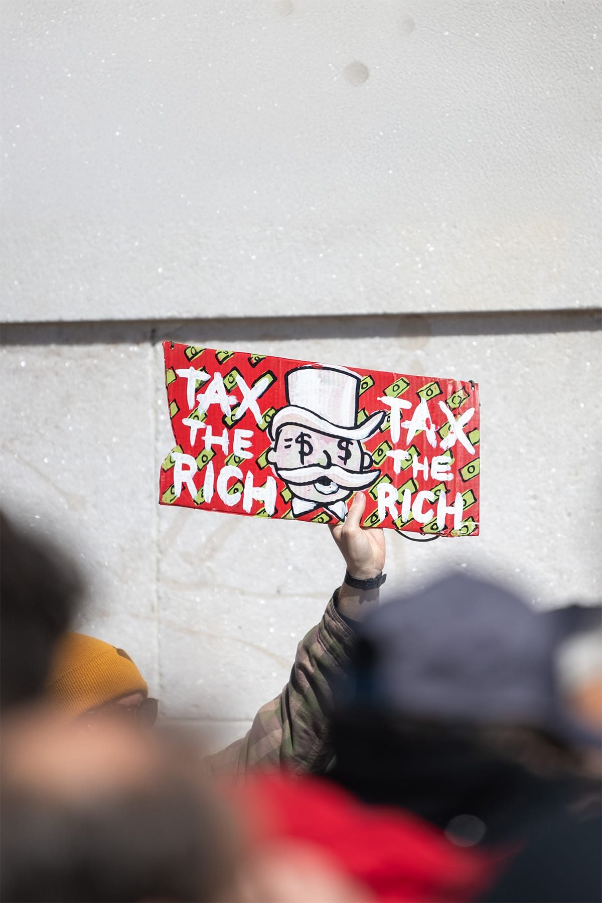
Theory becomes reality
As regular readers of this blog may know, I am not a great fan of academic economics. This is not just because I spent three years of my young life studying it and frankly being bored by it, but also because it so often fails to explain the messy real world we all live in.
I am also not impressed by a “science” that central bankers frequently rely upon to explain their judgements, but which simultaneously relies on completely unmeasurable concepts. Such as the output gap, inflation expectations, and r*, or the neutral rate of interest.
At a time when the ONS is struggling to accurately measure really basic things, like the population of the UK or the number of people in work, or indeed actual output, let’s remember that these concepts, although of interest to academics, are of very little use in the real world.
Given this iconoclastic perspective, you might be surprised to learn that one fairly simple economic theory does appear to be playing out in the real world and in a very measurable way, and that’s what I wanted to revisit here in this blog.
The growing tax burden
In Inequality Isn’t The Problem, posted in June 2025, I wrote about the gulf between perceptions of income and wealth inequality and the reality here in the UK. I referenced income tax data from HMRC from 2010 through to the tax year ending in April 2025.
Helpfully, this data is, for obvious reasons, very measurable and accurate. Part of the reason for revisiting this subject so soon after that last note is that new HMRC forecast data is now available for the tax year ending in April 2026. And it makes for very interesting reading.
First, I wanted to present the data. There is a lot of it, but I think it’s worth spending a little time reviewing some of the key points.
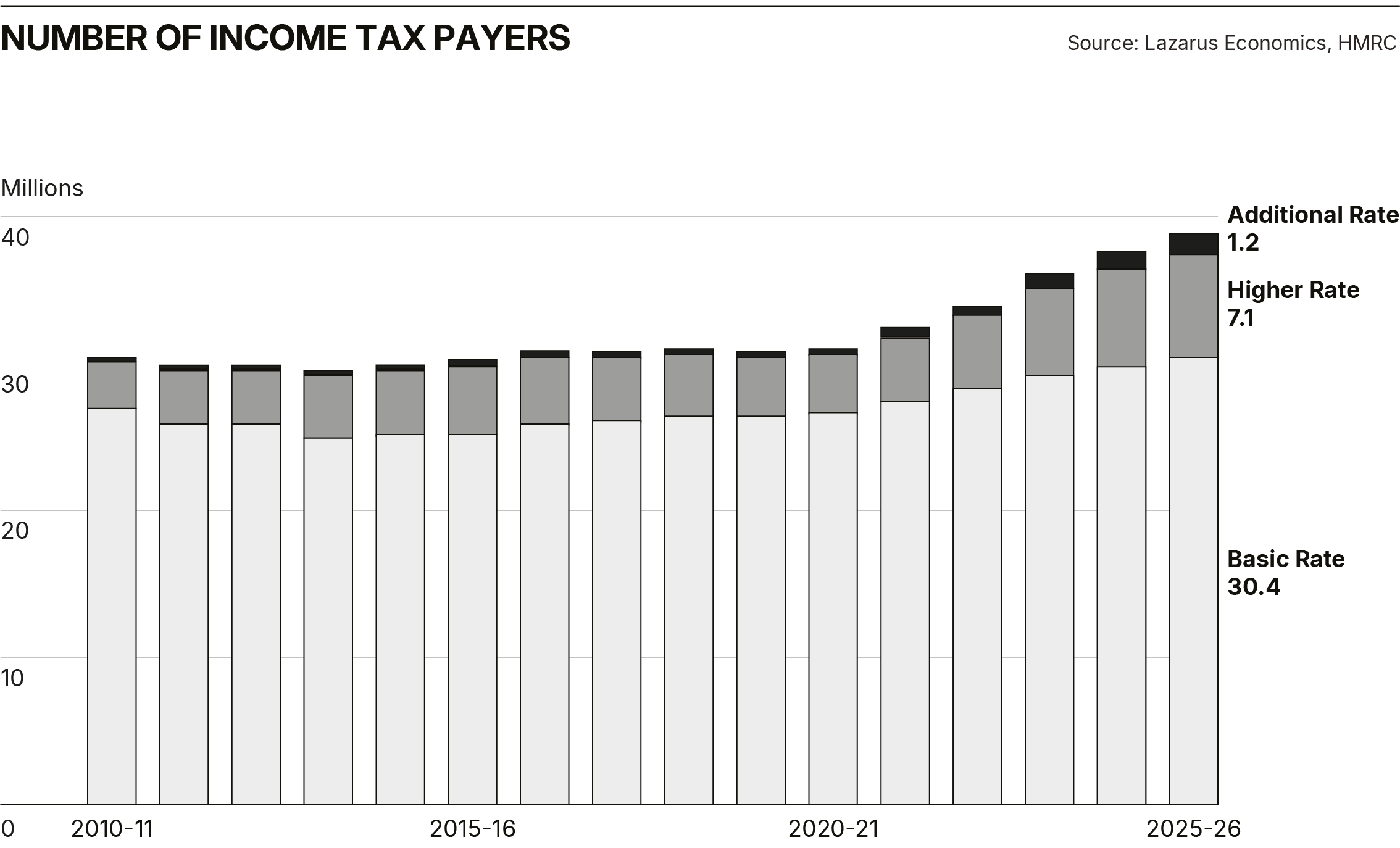
Readers who saw the June blog will be familiar with this table but not with the latest data for the current tax year. What is clear is that the trends I wrote about a few weeks ago are intensifying. I will summarise here the ones I think are most important.
- The number of people paying income tax has grown significantly over this period, by 8.1 million in just ten years. This is not just about more people in the workforce; it’s also the product of more people paying tax on the interest earned on savings above the standard personal allowance.
- There are 30.4 million basic rate taxpayers, nearly 78% of all taxpayers. This cohort now contributes 27% of the total income tax revenue. Ten years ago, they contributed 32%.
- As a direct result of the freezing of income tax thresholds, more people have been dragged into the higher-rate population of taxpayers. This population has increased by 57%, or nearly 2.6 million, over ten years and now accounts for 10.4% of all taxpayers, contributing 33% of all income tax revenue.
- For exactly the same reason, the population of additional rate taxpayers has increased by a staggering 340% over ten years and now stands at 1.23 million people. This relatively small group, which accounts for just 3.1% of the total population of taxpayers, now contributes 40% of all income tax receipts. Ten years ago, the same group contributed 31%. So, in the space of ten years, the proportion of total income tax receipts paid by the population of additional rate payers has increased by 29%.
I have included the following two charts to help illustrate how these numbers have changed over the last ten years.
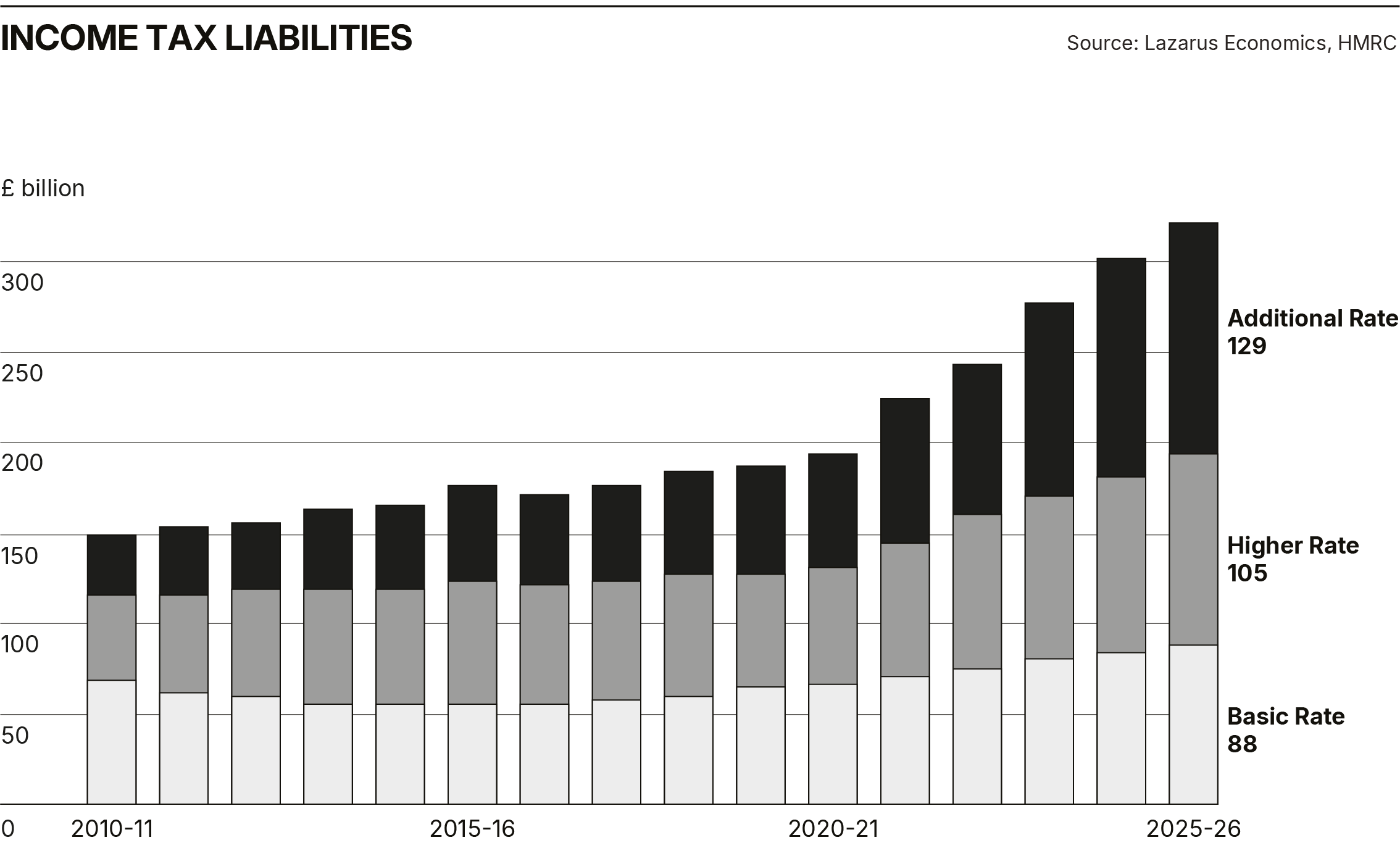
The final and possibly most telling point from this data is that 3.1% of taxpayers contribute £129 billion to the Exchequer. Ten years ago, that number was £35 billion. So, additional rate taxpayers contribute nearly 370% more than they did ten years ago. This is while basic rate payers, whose numbers have increased by 12%, are paying 28% more.
The Laffer Effect in action
Now, I am absolutely sure that politicians like Jeremy Corbyn and possibly many Labour backbenchers, and indeed umpteen podcasters who bang on about growing inequality in the UK, would welcome this data. I also imagine they would not be satisfied, I suppose, until the so-called “rich” were paying all of the income tax received by the State.
But for those with a modicum of economic intelligence, there is a very clear warning signal here. Over the last ten years, the Exchequer has massively increased its dependence on a very small number of highly taxed individuals. This has, in turn, created a critical vulnerability in the public finances that many people seem oblivious to.
And this is where the economic theory I referred to at the start of this piece comes in. I have mentioned it before, but will do so again here: it’s called the Laffer Curve. Fortunately, this simple theory can be represented graphically:
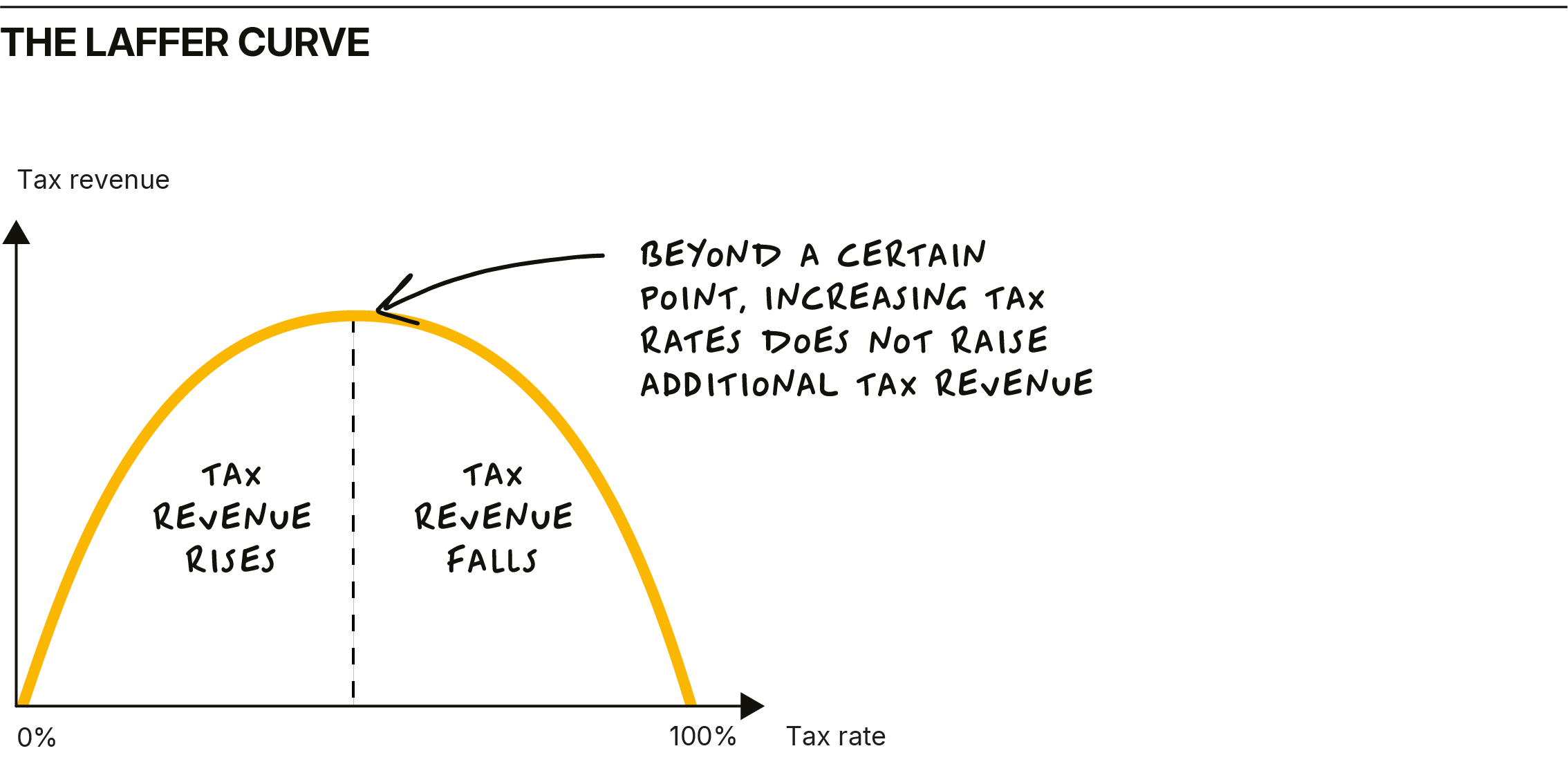
The theory was developed in the 1970s by a US economist named Arthur Laffer. It was designed to show the theoretical relationship between rates of taxation and the resulting level of government tax revenue. Like most economic theories, the actual shape of the relationship is uncertain and disputed. Nevertheless, one thing is clear from the relationship expressed in the theory: beyond a certain point, tax rates do not raise additional tax revenue. There are a few examples of this theory being tested in the UK in recent times.
Perhaps, most significantly, in the aftermath of the Labour government’s decision to raise the top rate of income tax to 50% in 2010. Subsequently, the OBR suggested that cutting the rate to 45% would at worst be revenue-neutral and at best revenue-enhancing. But right now, in what should be a very worrying sign for the incumbent government (that appears to think that it can grow taxation into its insatiable spending ambitions), there are clear signs that very high rates of taxation are resulting in lower revenue.
In a note I wrote earlier in July, I highlighted the example of Stamp Duty Land Tax, raised by successive governments to ridiculous levels. This tax is clearly suppressing activity in the housing market. As a result, the receipts from SDLT have fallen in real terms, down 15% since 2018. But this week, I was drawn to an even better empirical example of the Laffer Curve in action. This time, the effects are being seen in the receipts from capital gains tax, which, like SDLT, has often been seen by spendthrift governments as a “soft” target.
The current government raised the rate of CGT in the 2024 budget, but the latest data I can find shows that receipts from this tax have fallen. In fact, the tax take from CGT has been falling for a while. However, the rate of decline may now even be accelerating. CGT raised nearly £17 billion in the 22/23 tax year, £14.5 billion in the following year, and only £13.1 billion in 24/25.
In the first six calendar months of 2025, despite the increases in the rate of CGT and the reduction in allowances announced in last October’s budget, CGT receipts fell again on the same six-month period in 2024: by nearly 13%. I guess this isn’t just the product of fewer asset sales; it’s probably also the result of another Laffer effect on the taxation of non-doms and the exodus of millionaires from the UK to places like the UAE and Italy.
My conclusion is that the UK government should pay close attention to these unequivocal warning signs from the real economy that reflect a simple economic theory. If you tax people excessively, not only does it suppress economic activity and constrain growth, but it also results in lower tax revenue.
Final thoughts
In an economy that has become so dependent on a tiny fraction of taxpayers who already shoulder a vast proportion of total tax revenue, the warning signs for the government are loud and clear. If you keep going, more will leave, and suddenly the government’s stressed budget arithmetic will start to go seriously wrong.
There is one obvious, cold, hard reality here. Spending is too high, and sooner or later, this government will have to confront that, as will all of its backbench MPs, who appear to believe that there is a magic money tree solution to everything. Unchecked, these politicians really would run out of other people’s money.
Despite my usual scepticism towards economics as an academic discipline, I can’t help but notice that one classic theory (the Laffer Curve) is playing out in real life here in the UK. A small group of additional rate taxpayers now shoulders a staggering share of the income tax burden, while government receipts from capital gains and stamp duty are sliding as rates keep rising.
The numbers are clear: as tax rates go up and thresholds stay frozen, more people are drawn into higher brackets, and a tiny fraction ends up paying almost all the bills. Sooner or later, this starts to backfire. People leave, activity slows, and overall revenue falls. Simply put, you can’t tax your way to prosperity; eventually, you just run out of other people’s money.
If you’ve found this perspective useful and want to see how it shapes the way I invest, you can track my strategies in real time through W4.0 — the platform I’ve built to share my thinking, portfolio changes, and market commentary directly with subscribers.
For August only, we’re offering 4 months free on all annual plans — giving you a full year’s access for the price of eight months. You’ll get every strategy, update, and insight, plus the tools to create your own custom versions.
Related posts

Subscribe to receive Woodford Views in your Inbox
Subscribe for insightful analysis that breaks free from mainstream narratives.